

Most CFOs can pull up their P&L in 30 seconds.
Revenue, burn rate, runway, cash position — all real-time. But ask them about their health plan?
“We’ll know in a few months when the renewal comes.”
We think that should end now now.
If we going to run our health plan like a product, we need product discipline. That means objectives, key results, and measurable progress — not annual hope cycles. Objectives and Key Results (OKRs) force clarity: What are we building? How do we know it’s working? What does success look like this quarter?
Objective = The big thing you want to accomplish (like “become a better basketball player”)
Key Results = The specific, measurable ways you’ll know if you succeeded (like “make 8 out of 10 free throws” or “practice 4 times a week”)
Instead of just saying “I want to get better,” OKRs force you to say exactly what “better” means and how you’ll measure it. Companies use them to make sure everyone knows what they’re working toward and can prove whether they actually got there.
For a health plan, that looks like:
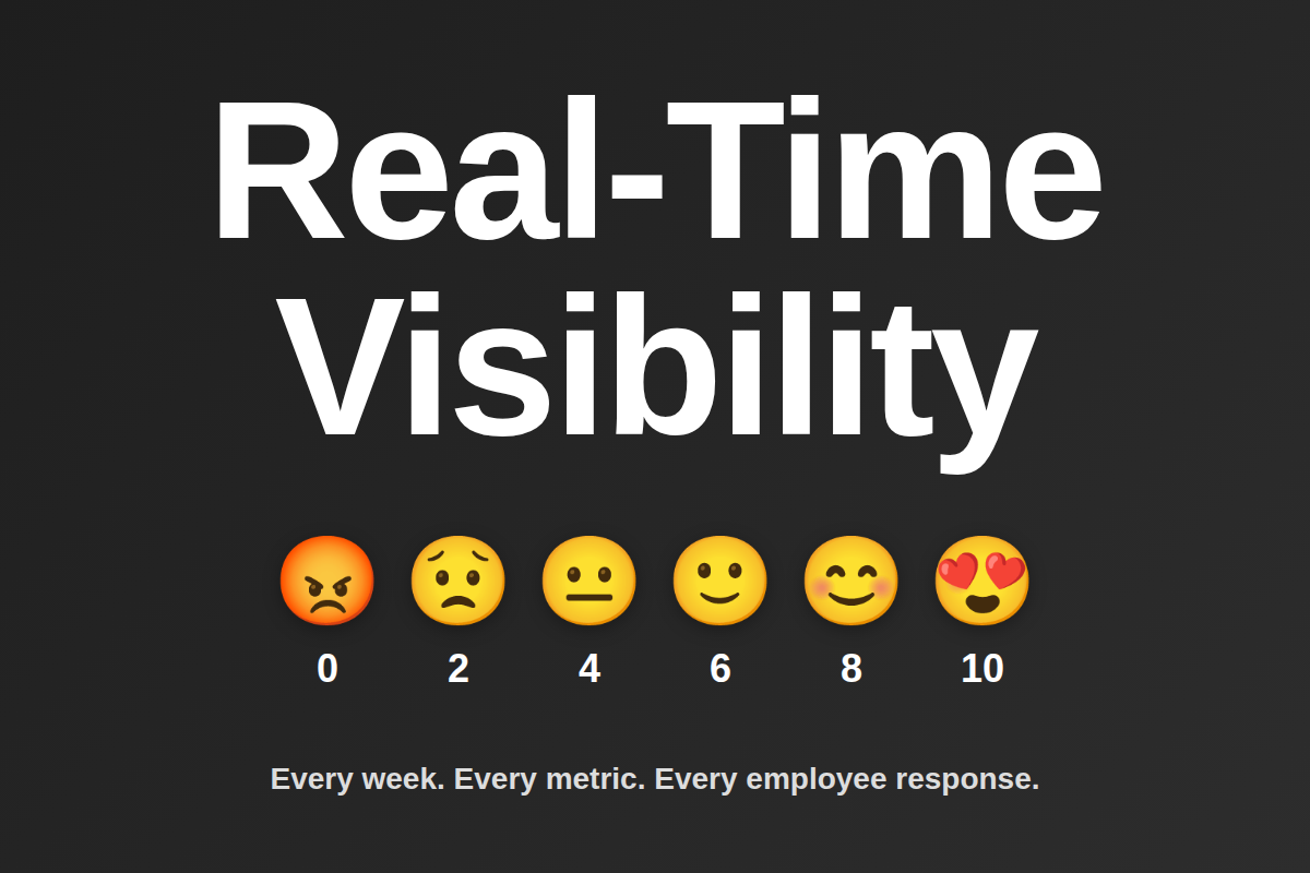
- Real-time visibility instead of annual summaries
- Weekly routing decisions instead of renewal surprises
- Measurable employee experience instead of complaint management
- Financial forecasting instead of budget shock
Q1 OKR — Establish Real-Time Plan Visibility
Objective: Launch a real-time dashboard that gives everyone the visibility they need to manage the health plan like any other part of the business.
Key Results:
- Integrate with TPA claims — Real-time claims data pipeline. The technical work here is straightforward and honestly pretty boring: connect to the TPA, build the data pipeline, set up automated syncs. It’s infrastructure. The plumbing that makes everything else possible. We don’t need to dig into the weeds on this one, but if you’re dealing with TPA integrations and want to compare notes on what worked (or what did not), happy to discuss.
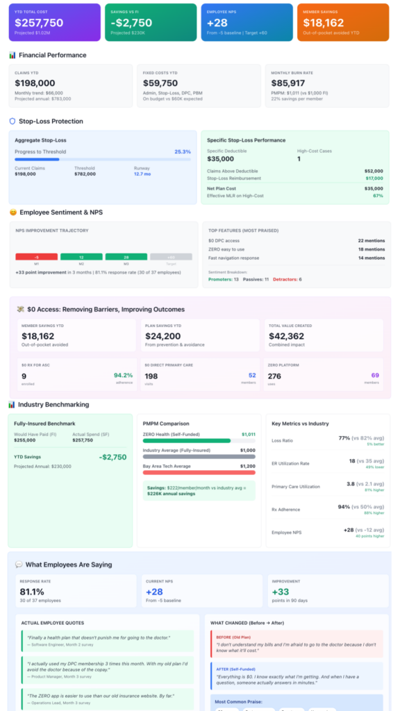
- Build the Dashboard with:
- YTD costs, claims tracking, fixed costs vs. budget, etc…
- Actual vs. Projected vs. Maximum Exposure
- Fully-Insured Comparison Benchmark
- Aggregate and Specific Stop-Loss Tracker
- Real-time NPS tracking with sentiment breakdown
- Member savings (out-of-pocket avoided)
- Plan savings (prevention & avoidance)
- Program-specific utilization (DPC, ZERO)
Traditional fully insured, and to some extent self-funded, plans give you an annual renewal number and pray you don’t ask questions.
We’re building something different — a dashboard that shows what’s actually happening in real-time. And the numbers in the visual aren’t real we want help on what to measure at this point. We will talk about the results once data starts flowing but we want to answer some critical questions as we go…
- Are we spending what we planned on admin, claims, DPC?
- Where are we tracking against projections? Best case? Worst case?
- How close are we to our stop-loss threshold?
- What would we have paid under the old fully-insured model?
But Here’s the Thing:
There’s zero point in doing this publicly if we can’t crowdsource wisdom from people smarter than ourselves. We don’t have this all figured out. We’re just getting going. We’re making educated guesses about what matters most.
So we need your input:
What are we missing? What metrics would you kill to have visibility into?
What are we overthinking? What looks good on paper but won’t matter in practice?
What are we not thinking about? What blind spots do we have coming from a tech company vs. manufacturing vs. healthcare vs. retail?
Comment. DM. Tell us we’re doing it wrong. Share what your broker or carrier told you was “too hard to measure.” Show us your internal dashboards if you’re already tracking this stuff.
The best version of this dashboard doesn’t come from us alone — it comes from the collective experience of every leader who’s tried to run their plan like an actual business.
Week by week. In public. With real feedback